This column is in collaboration with Jaclyn Isaac and focuses on the interior design and inspiration behind some of our favorite places in Jersey City. Jaclyn is an interior decorator and design blogger in Jersey City. Her personal blog can be found here.
Pompeii. Sorrento. Positano. Capri. A black and white dog nicknamed “Oreo”.
What do all of these things have in common?
They were the design inspiration for GP’s, everyone’s favorite Italian restaurant in Hamilton Park and a space designed by HGTV star and petite powerhouse designer Vanessa DeLeon. I met with her in her fabulous design studio in the Starrett-Lehigh building in New York City, home to Martha Stewart, Tommy Hilfiger and the like. While Vanessa was stuck in traffic, her assistant [and mom!] Barbara enthusiastically showed me press upon press for Vanessa and her work. Needless to say, she was proud. And after meeting Vanessa, it was clear why.
Jaclyn Issac: So let’s start with George [owner of GPs]. How did you two meet and get the design process started?
Vanessa DeLeon: We met through mutual friends. I was on Restaurant: Impossible and he saw me on a flight back from Miami to NYC, and we started chatting. He had already secured the Hamilton Park location and I loved it! It was so cute; the area, the stores. When we did the walk through he said he wanted something bistro-like. So we went to a few Italian restaurants in Soho, restaurant hopping to get some ideas. We went to this restaurant that was really quaint and just had that cozy yet chic aesthetic: vintage tile, café chairs, minimal design but a place that you felt really comfortable in. I fell in love with that concept but I wanted to make and create something that was a little different and set him apart from the rest of the places he had shown me.
JI: And you just serendipitously had a trip booked to Italy at that time…
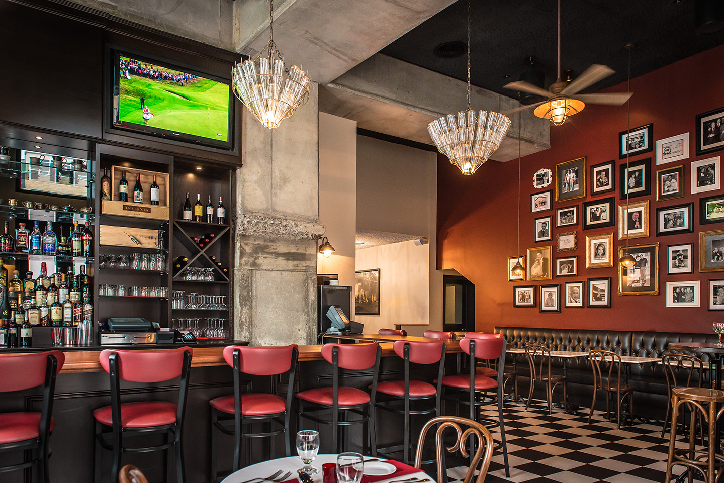
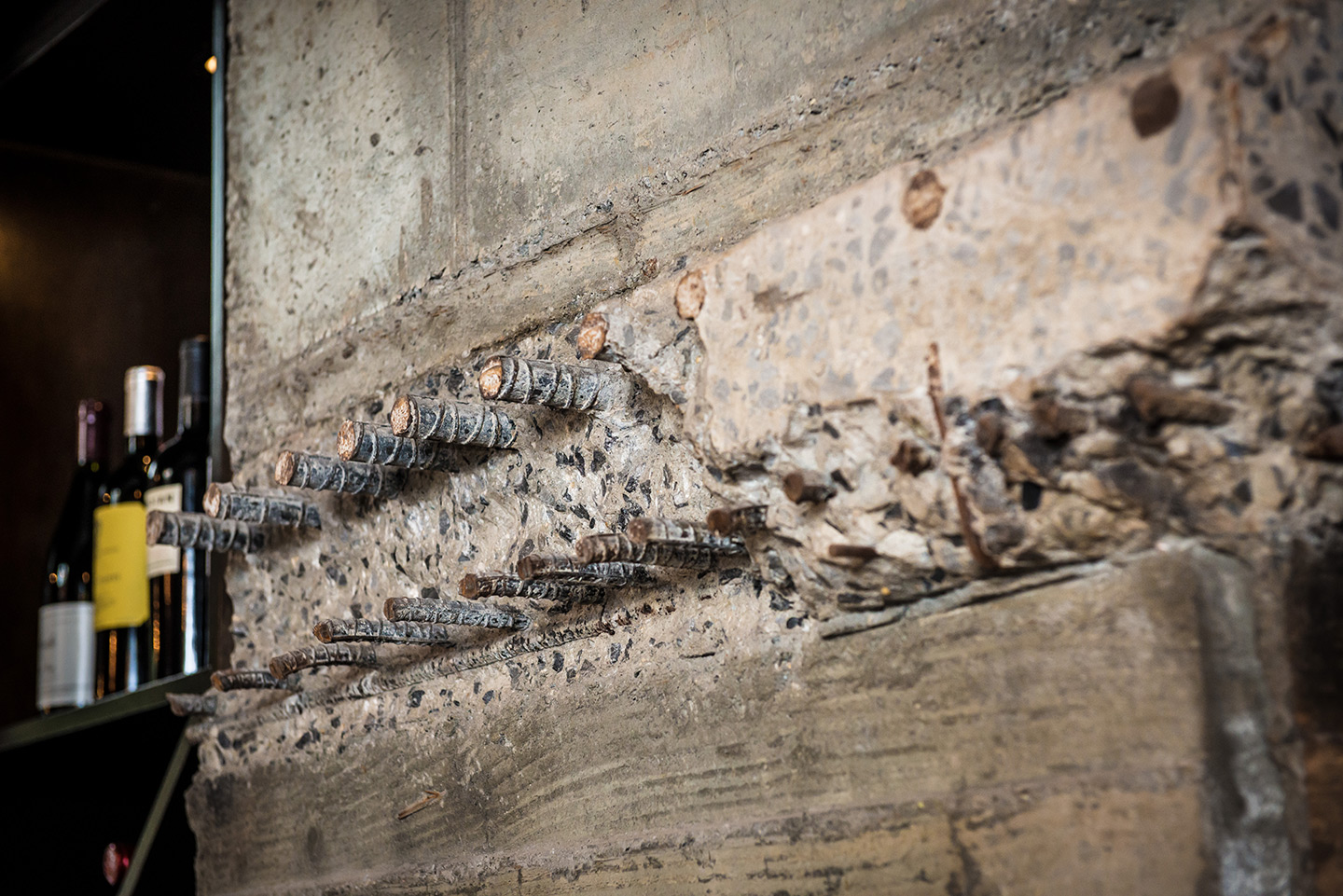
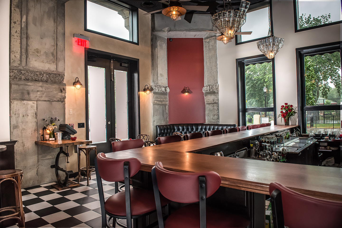
VD: Haha, yes! When he hired me I was going to Italy at the time, I was like this is perfect. I went to small boutique type restaurants and mom and pop places. I did the whole site seeing thing, seeing the ruins, all that. When I started putting the pictures together I was seeing an interesting story. Every spot that I went to in Italy is in GP’s. I was followed by this black and white dog I nicknamed Oreo. Oreo was my inspiration for the black and white tile on the floor. I loved the charm, the bare buildings of the space itself. I wanted to leave the rebar and the exposed building so we left some of it.
JI: Was he all in?
VD: Oh yeah, all in. Obviously he had a lot of opinions, he’s the business owner; there were tweaks and stuff made but the design concept stayed.
JI: What are some of your favorite things about the space?
VD: The marble-topped bar, but it’s really hard to keep up. We were going to do a decoupage of the bar with old pictures of his dad with Frank Sinatra and other famous people who have visited the original GPs in Guttenberg, but George was nervous about the execution – he thought the bar might ruin those memories, but we’re toying with doing that now. The overall layout is not uptight. The drama of the high ceilings are awe-inspiring but still feel cozy. I love the pendants with the old bottles – they came from a company called Troy Lighting – but we changed out the bottles to put GP’s spin on it. Oh, and the famous wall! We wanted to give homage to what his dad used to do – I sat and ate at the Guttenberg location – he had this “Frank Sinatra sat here” sign. I wanted it to look collected and George actually put a lot of that together himself. It’s a conversation piece without having a lot of clutter.
JI: So everything on the wall is authentic?
VD: Yes, nothing from Etsy or anything like that.
JI: How did you make it look collected and not cluttered? That’s a fine balance.
VD: I actually do a 3D rendering. I had the images photoshopped and then I did a grid from the elevation to the rendering. When you’re doing it in the field you may have to make some tweaks. You can do a grid on graph paper with a quarter inch grid. We call it the “love wall” – they are so popular now.
JI: What else are you working on in the area?
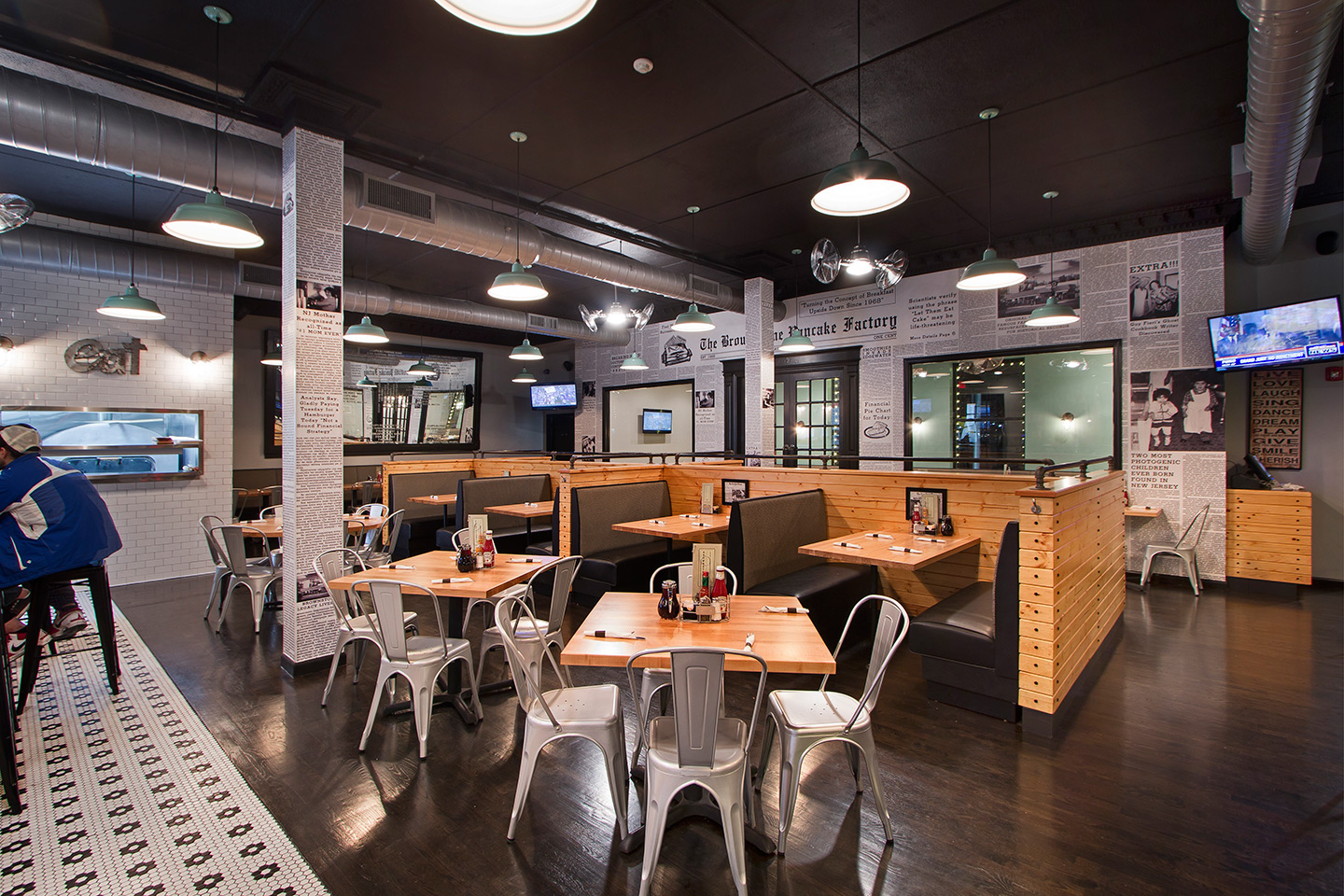
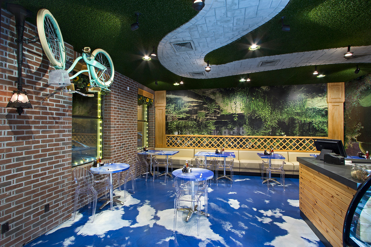
VD: The Gold Coast (Hudson waterfront) is my thing, but now we’re working all over, internationally and elsewhere. I worked on a project at 77 Hudson – we did the staging, a big party to open it, it was fun! My husband’s family also owns the Brownstone Diner and they just opened up a new one in Edgewater – you have to see that space! I designed it as an upside down park. Clouds on the floor. Upside down benches. It’s so fun.
JI: Thoughts on Jersey City’s continued transformation?
VD: Jersey City is exploding. I grew up in Union City so I’ve seen the change. Talk about a melting pot –teenagers, baby boomers, young families; it’s crazy.
JI: Have you been back recently?
VD: To GP’s, yes of course, but not back to truly explore the area. I love Smith and Chang’s… are they still there?
JI: Yes, but are now a café.
VD: A café? I purchased so many things from there!
JI: Yeah, the neighborhood is definitely changing!
VD: Looks like I need to make a return visit…
And here’s a video on GP’s design process:
[gmap height=”250px”]236 Pavonia Ave, Jersey City, NJ 07102[/gmap]
GP’s Restaurant – 236 Pavonia Ave, Jersey City, NJ 07102
