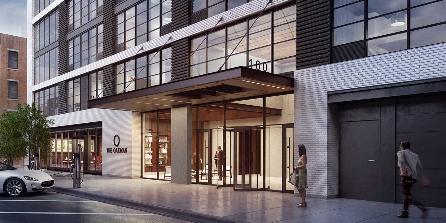
A computer-generated rendering of a proposed space is to the real-life build-out what a selfie with maybe just one filter is to the real shot. Nearly identical. But a little softer. Renderings have become de rigueur for any real estate project going to market, sparking excitement and distinguishing a development often even before breaking ground. The rendering process can be very involved, but it is becoming increasingly refined, making it possible to create extremely accurate, high-quality renderings in no time.
Fogarty Finger (FF) is an NYC-based architecture and interiors firm founded by architect Chris Fogarty and designer Robert Finger. FF has designed a number of high-end, luxury, residential buildings in Jersey City, including Hamilton House, The Oakman, The Art House, and most recently, 321 Warren. For each of those projects, equally luxe, high-end renderings were produced for marketing materials, and FF gave Jersey Digs a glimpse of how they get it done.
The rendering begins with an approved angle. FF presents a range of angle options and brings everyone to the table–developer, marketing team, advertising agency, brokers–to review and select the final. Achieving (and agreeing on!) just the right angle takes time, but changing it after the fact is a costly and difficult process, so sticking with it is highly suggested and worth the initial effort. Once selected, a detailed, 3D model of the view is created and sent to the rendering firm.
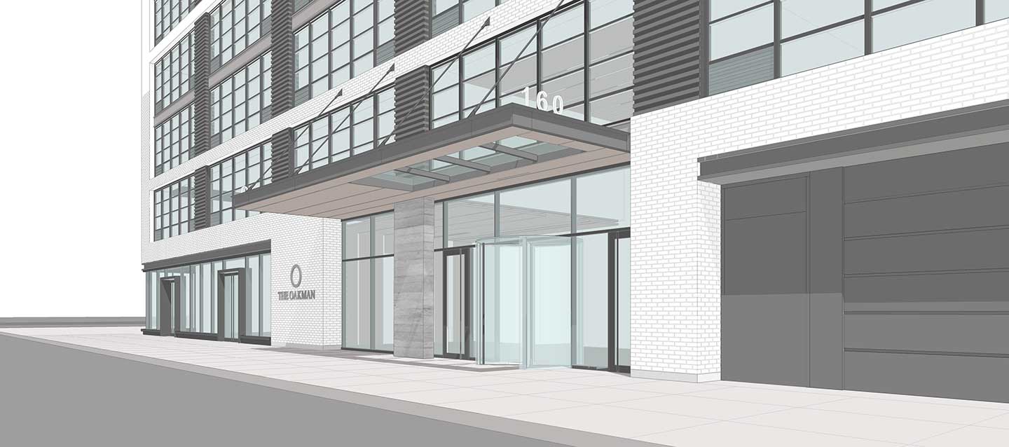
FF works with a number of rendering firms at different price points and abilities located everywhere from New York to Budapest to China, and FF art directs the rendering through initial drafts only they see, developing the depth of the image through color, texture, and context like landscaping and surrounding buildings or views.
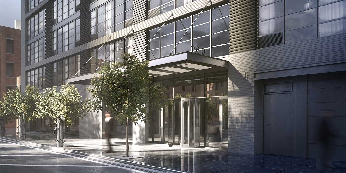
Once it’s far enough along, the rendering is shared for comments, and there is some (or a lot of) back and forth, depending on the number of cooks in the kitchen, making minor adjustments. Perfect lighting is the key ingredient. In the entrance rendering of The Oakman for example, the lighting was adjusted to bring out the white of the brick and cast no shadows on the exterior or sidewalk which changed the image dramatically from the early draft. This chosen time of day also allows for a clear view into the lobby. Trees were also downplayed or removed, so the electric car charging stations would not be obscured.
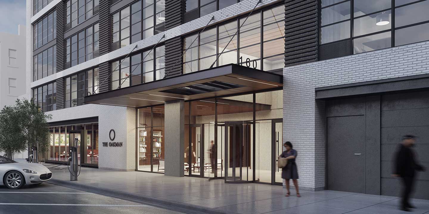
Finally, the people, if applicable, and surroundings are perfected then the final high-resolution image is rendered and ready for any and all marketing materials.

Renderings are especially great for showing amenity spaces that are often the last phase of construction and even better for illustrating an architect’s vision that on paper sounds really interesting architecturally, but is hard to visualize. A rendering is a standalone piece of artwork worth more than a thousand words of descriptive copy and maybe hundreds or even thousands of dollars per square foot in rentals or sales.
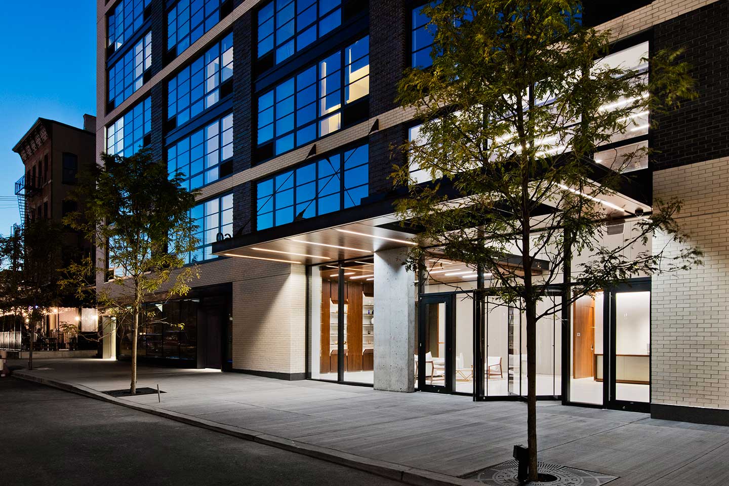
Fogarty Finger’s renderings are among some of the best, photo-real renderings. Occasionally, they receive a draft with a Chinese telephone box on the street or cars driving the wrong way down a one-way, but the final images are impeccable and really difficult to differentiate from the photos of the finished spaces.
